Industry
Wellness & Lifestyle
Market: worldwide
Business benefit
How Gusto refreshed a women's sportswear brand identity for the GCC expansion


What we do
We refreshed the brand identity, redesigned packaging, and built marketplace visuals for a sportswear brand expanding across two markets.
Our goals
Forstrong's identity had served the brand well but needed to evolve. We preserved the core DNA - the bold red and black palette, the energy, the attitude - while refining the logo, typography and visual system to feel more premium and cohesive.
Alongside the identity refresh, we redesigned the full packaging experience - custom mailers, branded tissue, inserts - turning every delivery into a brand moment. We also rebuilt the marketplace product cards from scratch: clean layouts, confident visuals, designed for conversion in a market where you get 1.5 seconds of attention.

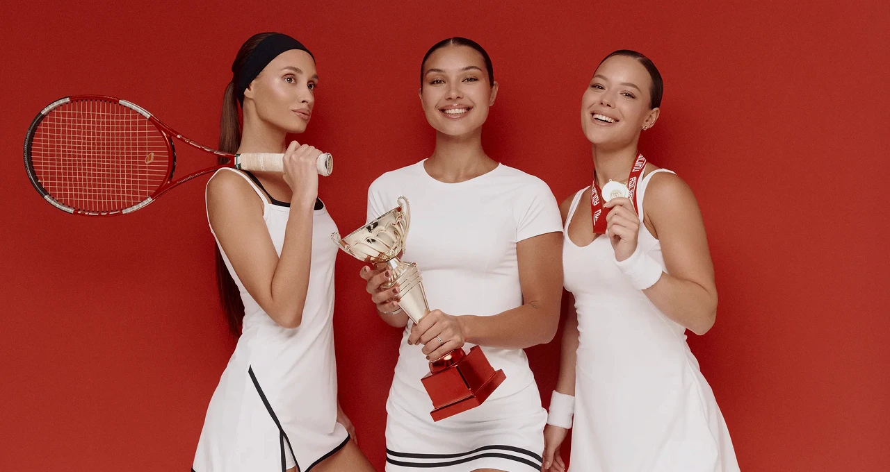
A little about the brand
Forstrong is a women's sportswear brand built by athletes, for athletes. Founded by Alexandra Shoman, the brand has earned a dedicated community across two markets with performance-driven designs that refuse to compromise on aesthetics.


Our refresh
The existing identity had energy but lacked consistency. We kept the bold red and black palette that Forstrong's community already identified with, and rebuilt everything else around it - a refined logo, a tighter type system, and a visual language that translates across e-commerce, packaging, and social.
The packaging was redesigned end to end. Custom mailer bags, branded tissue, motivational inserts - every touchpoint considered, every detail intentional. The goal wasn't just to look premium, it was to make the unboxing feel like part of the product.


What we do
We rebuilt every product card with a single objective: conversion. Clean hierarchy, lifestyle context, and visuals confident enough to hold their own next to global competitors.


What we do
Every order is a brand moment. We redesigned the packaging system from mailer to unboxing - custom bags, branded tissue, inserts with personality. Designed to make a first-time buyer feel like a VIP and come back for more.
What we do
We refined the brand identity, redesigned the full packaging experience, and created marketplace visuals built to convert across two markets.


Our goals
Evolve the brand without erasing it. We kept Forstrong's signature energy and colour palette and rebuilt the visual system to feel more refined and consistent across every touchpoint - from logo to label to marketplace listing.
Then we redesigned the packaging to turn every delivery into a brand experience, and created product cards engineered for scroll-stopping conversion.
Clients review
Gusto understood what made Forstrong special and didn't try to change it. They made it sharper.

Eugenia
Brand manager
More cases:


