
Industry
Beauty & Skincare
Our role
Market: worldwide
Business benefit
How Gusto gave a premium skincare brand a visual language worth the price tag

What we do
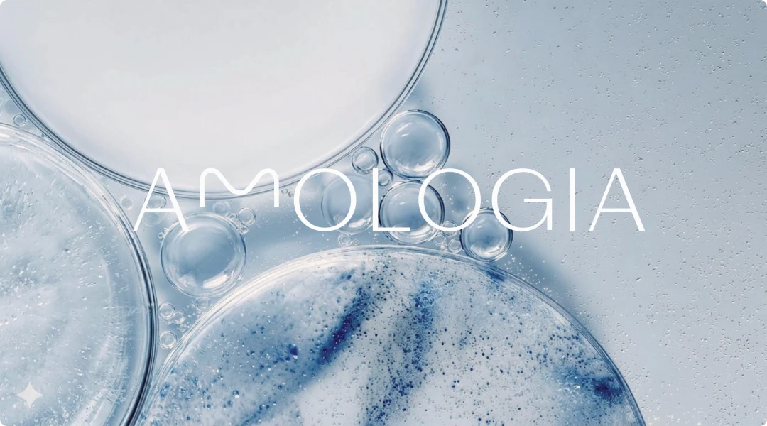
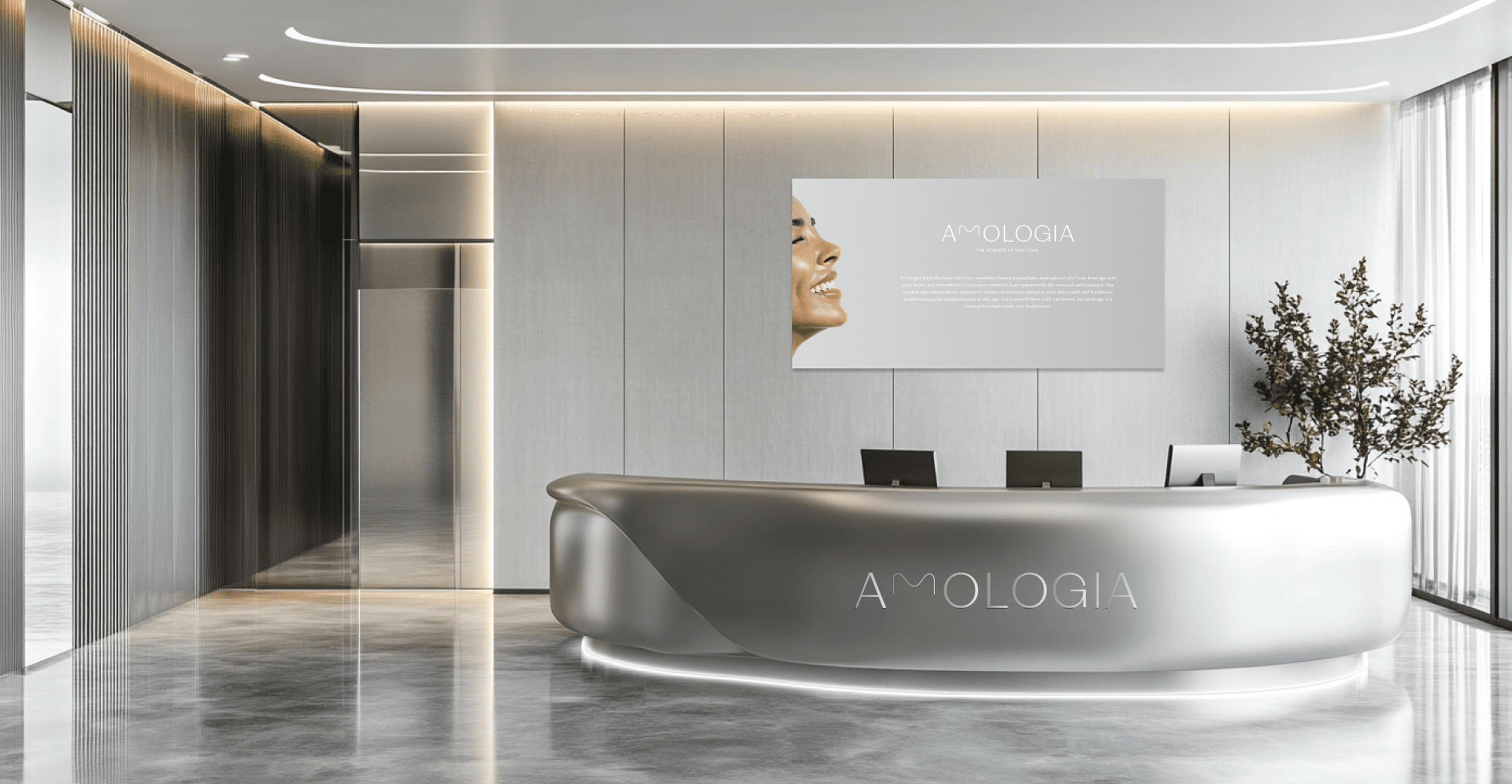
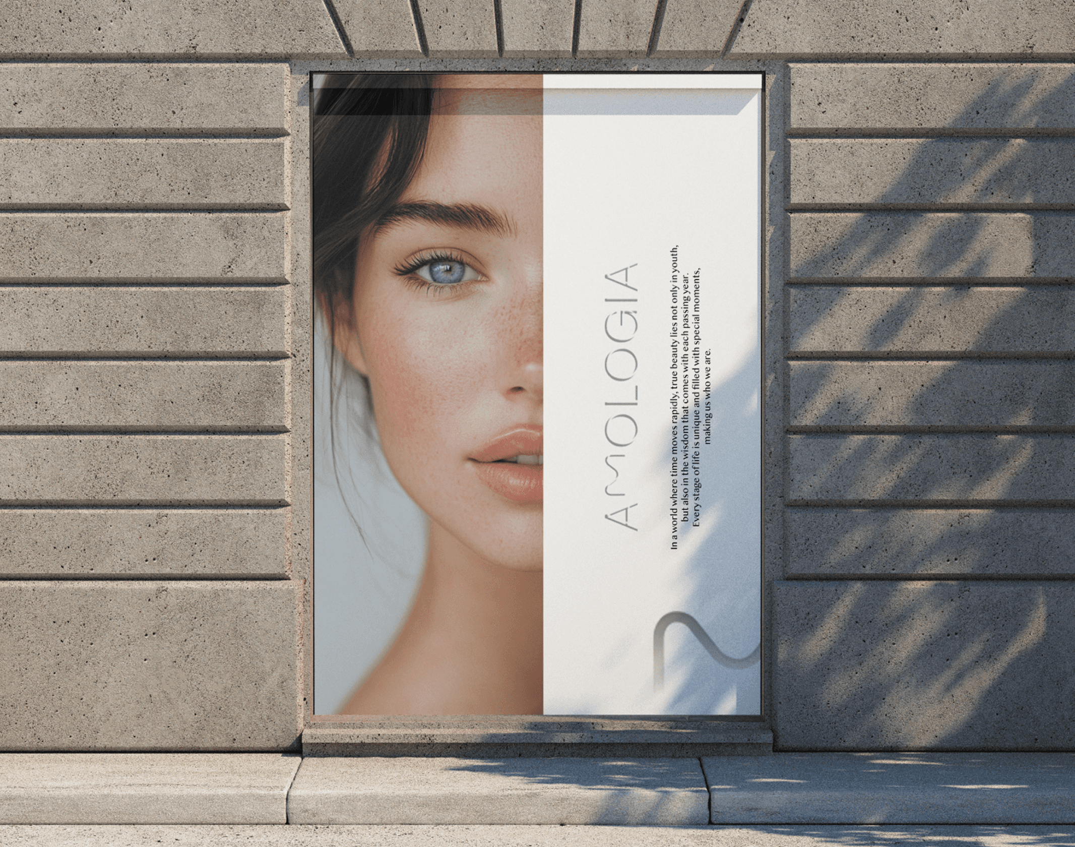
We built the brand identity and packaging system - visual language designed to communicate purity, trust, and premium positioning without a word of explanation.
Our goals
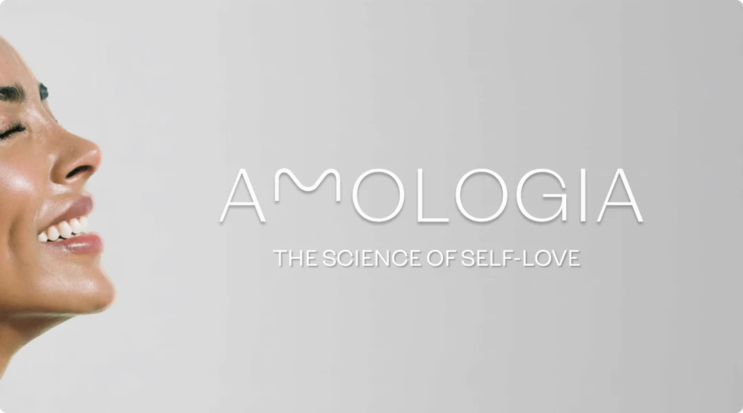
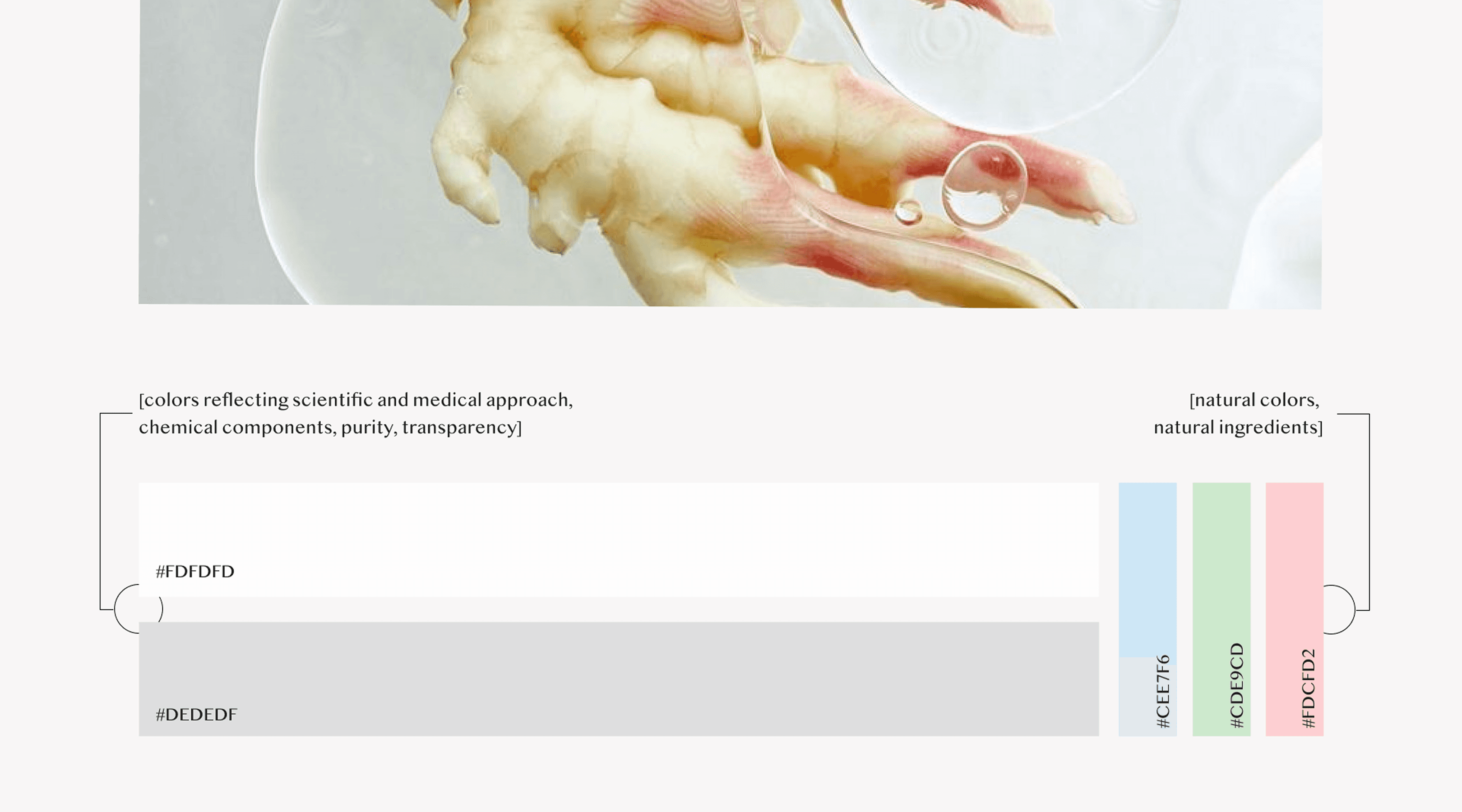
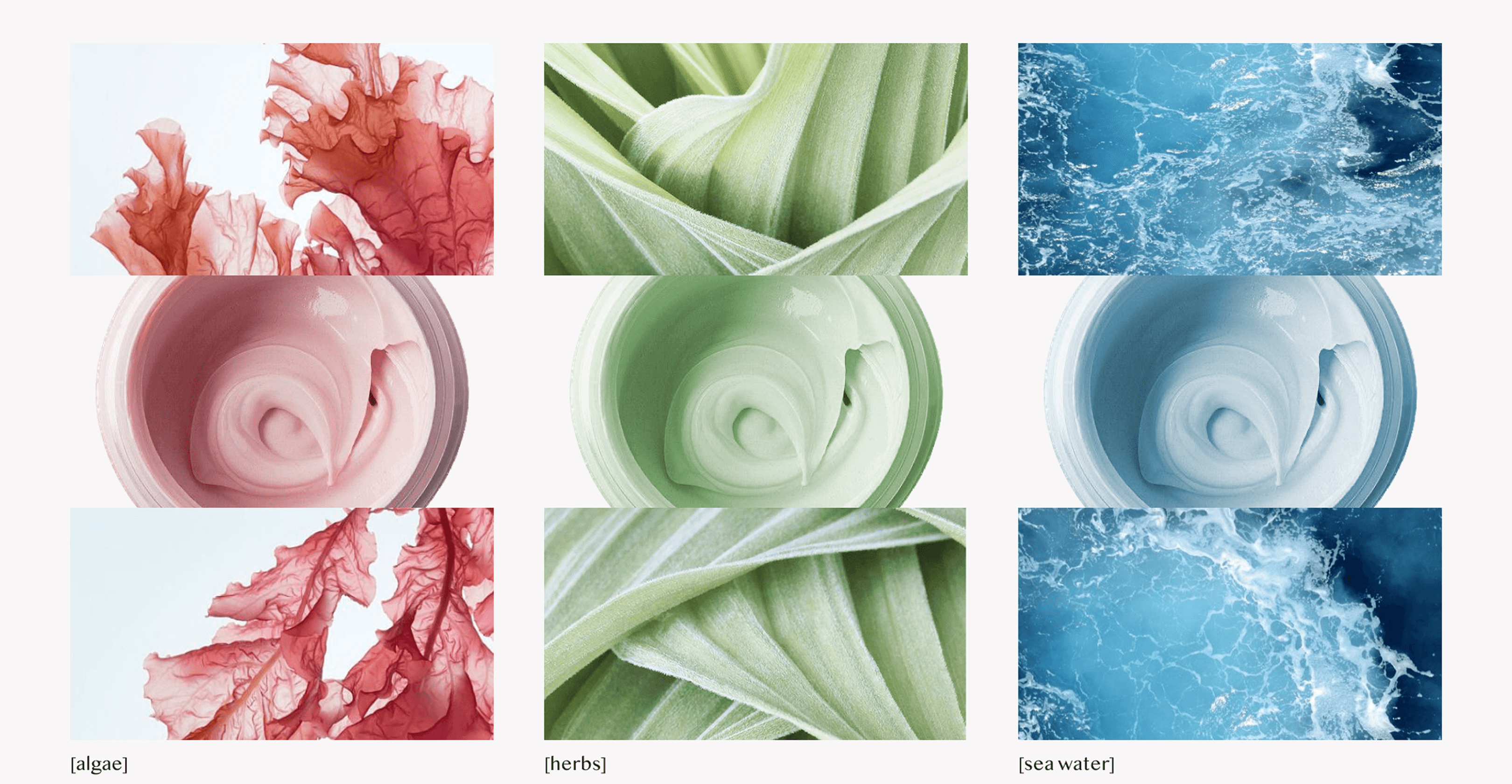
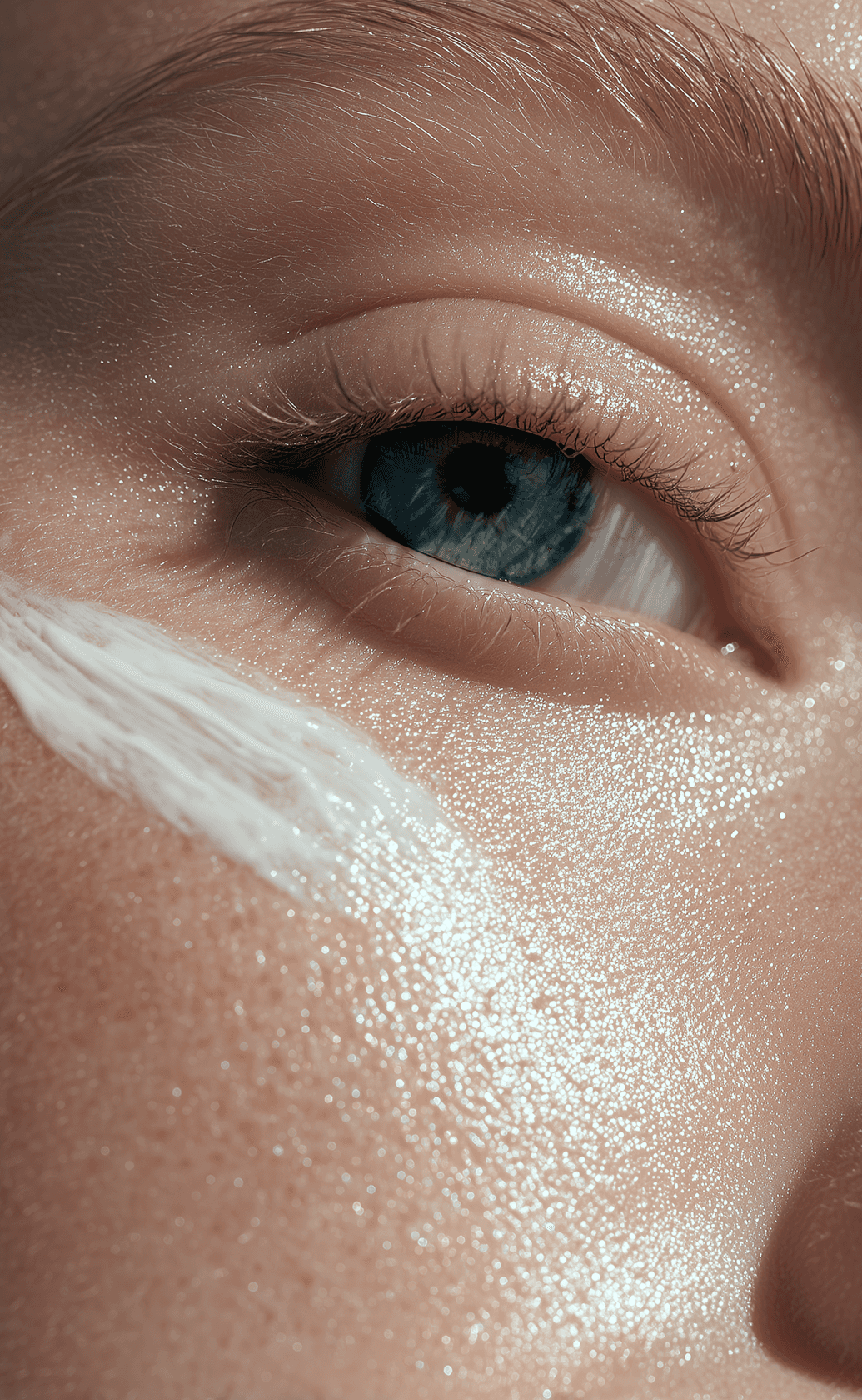
Skincare is a crowded shelf. To make Amologia stand out, we leaned into quiet confidence. We needed to balance clinical credibility with human warmth - avoiding cold lab aesthetics and generic wellness tropes. The result is a premium, cohesive system that proves its value before you even open the bottle.
A little about the brand
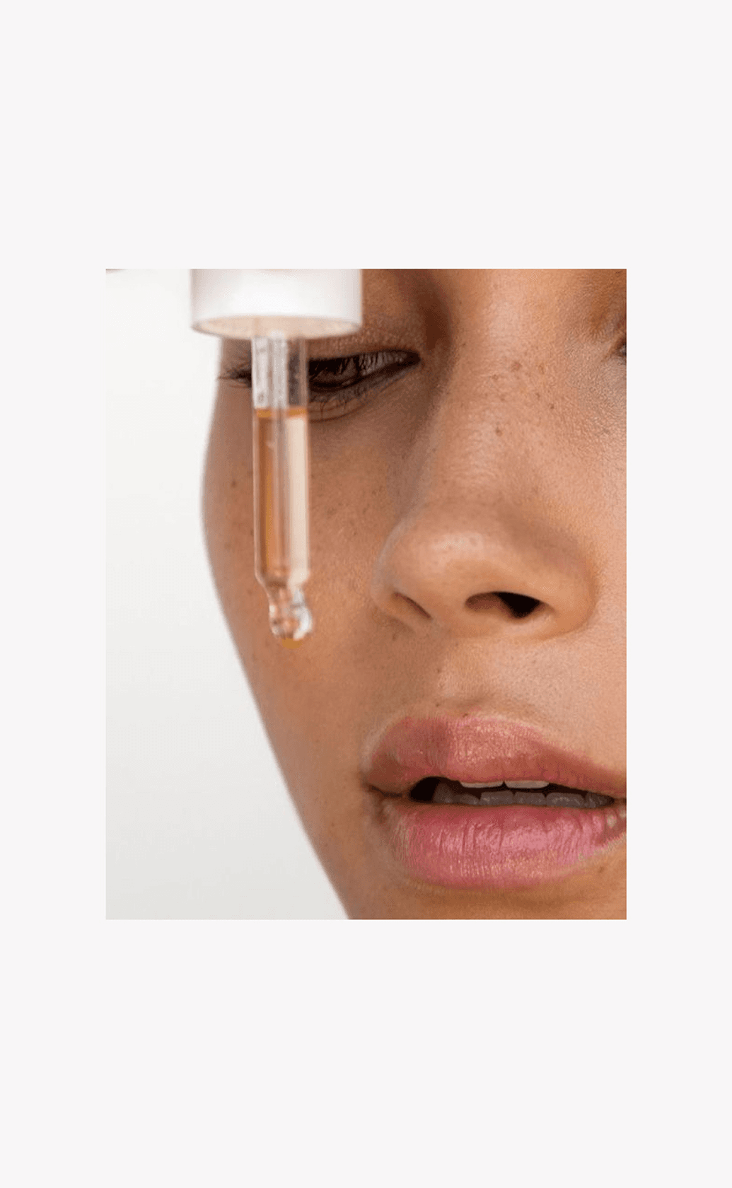
A premium skincare brand built on the premise that science and self-care belong together. Formulated for real results, designed for daily rituals.
Our approach
Scientific precision doesn't have to look sterile. We built an identity that relies on quiet confidence — clean typography, muted palettes, and unapologetically minimal compositions. It’s a visual system designed to communicate trust and premium quality without ever raising its voice.
What we do
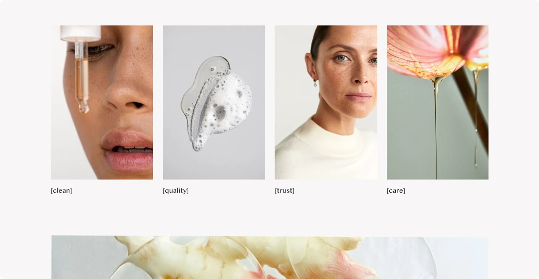
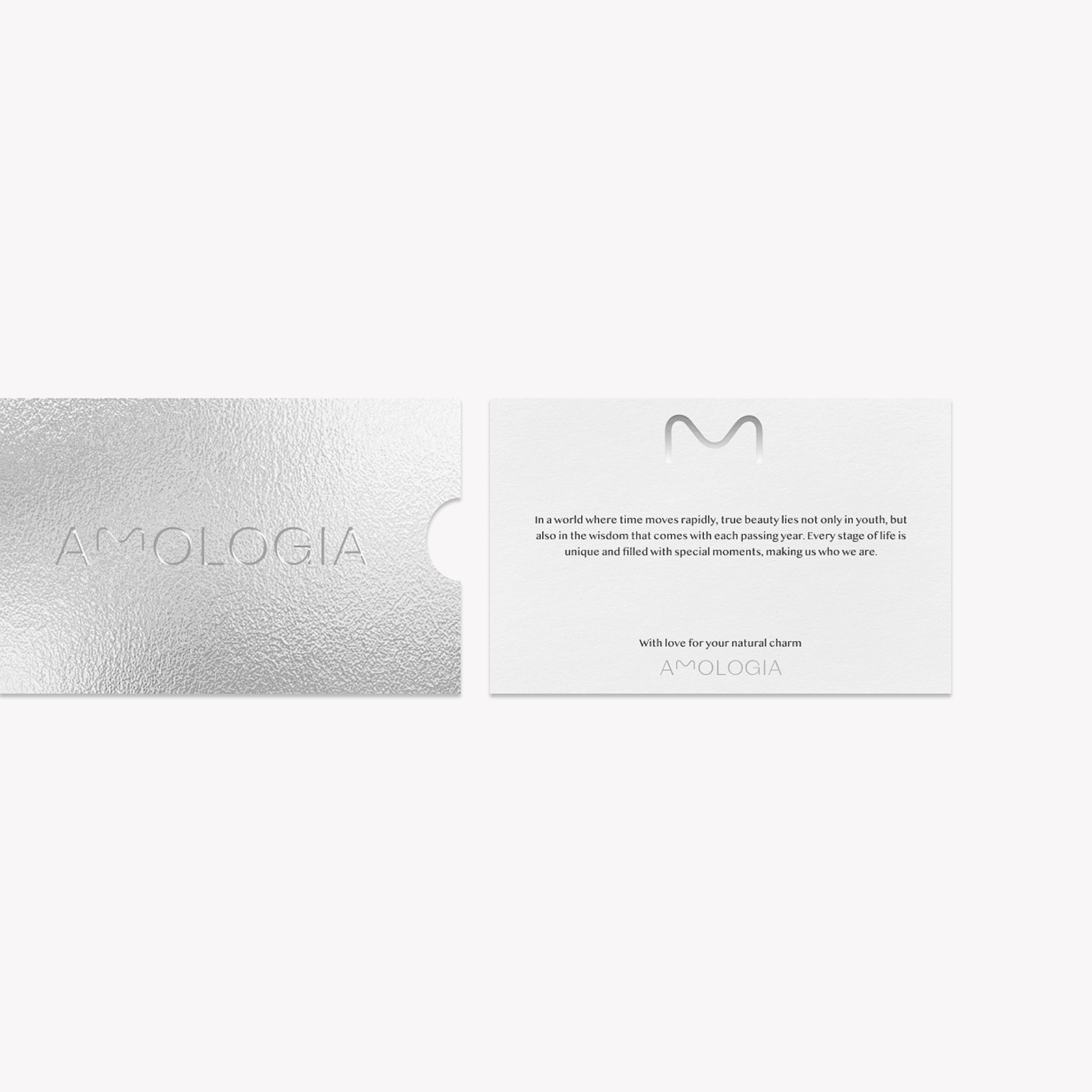
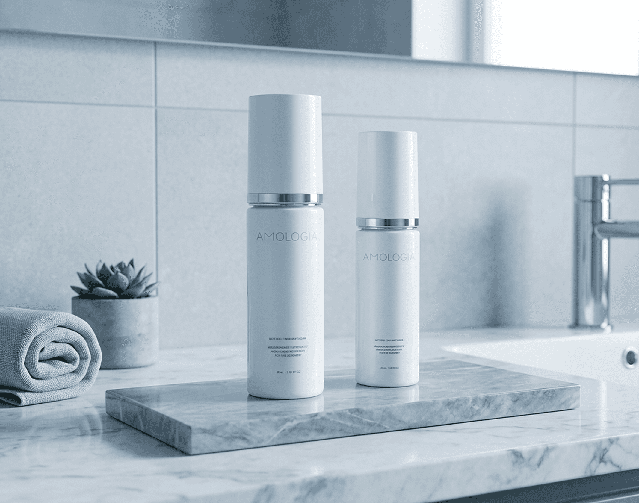
The identity had to do the heavy lifting across every touchpoint. We designed a cohesive visual system — from the core logo and typography to the final unboxing experience — built to scale as the product line grows.


What we do
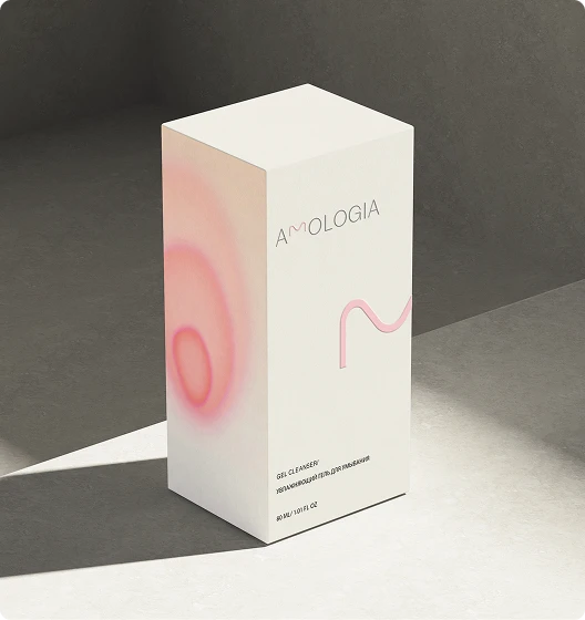
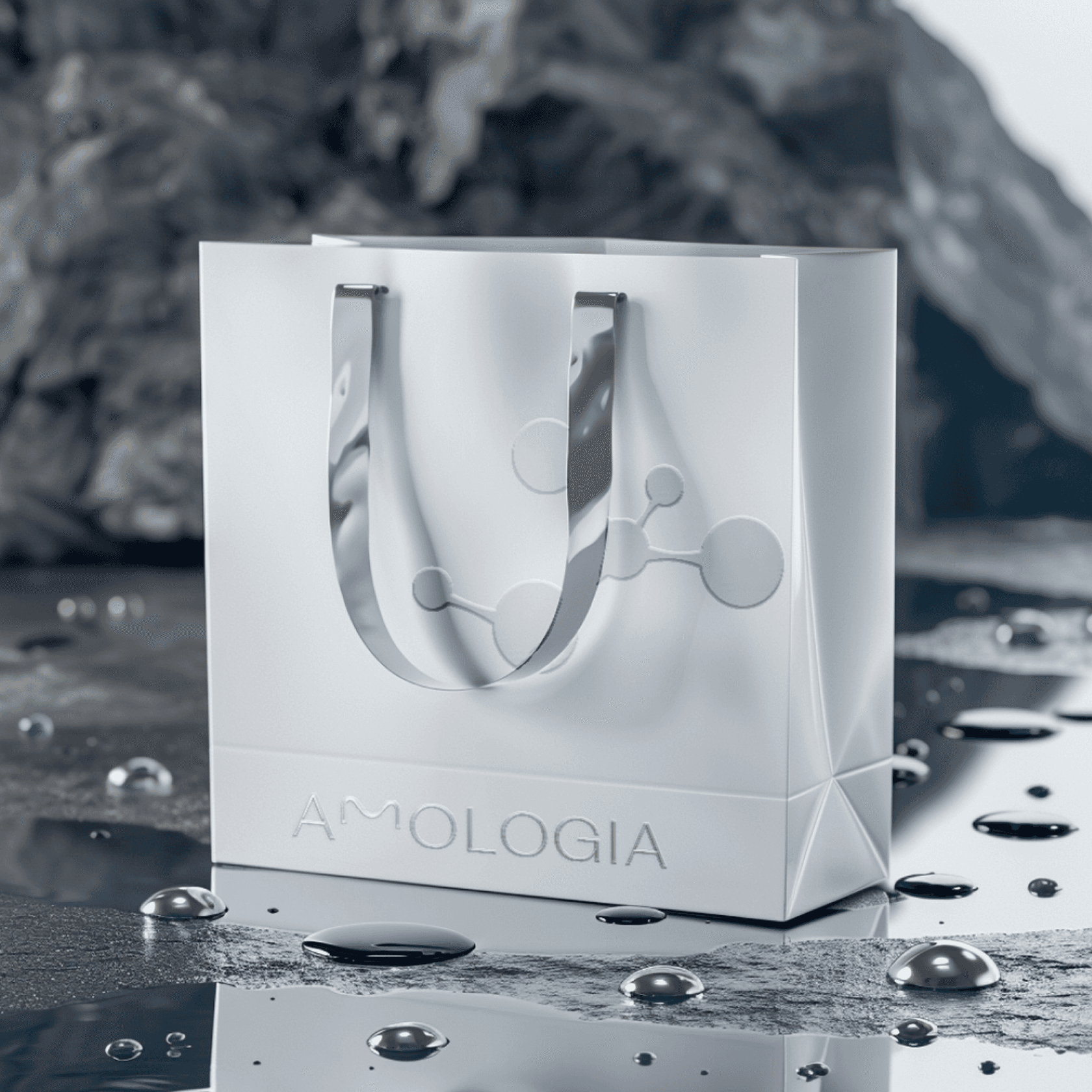
We designed the complete packaging ecosystem — jars, labels, and outer boxes. A refined, cohesive system that works just as well on a bathroom shelf as it does on an Instagram feed.
Our goals
Packaging is the first physical handshake with the customer. It had to feel expensive without shouting. We focused on tactile materials, clean compositions, and subtle details — turning the simple act of opening a box into the first step of a self-care ritual.
Clients review
Working with Gusto & Oomph felt thoughtful and collaborative. They translated our philosophy into a beautiful brand that truly reflects our brand.

Maria
Marketing manager
More cases:


